April 24th, 2013
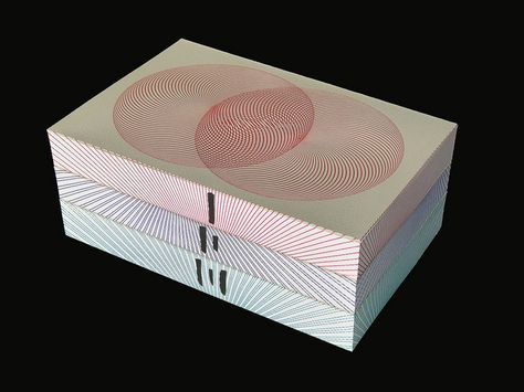
The signed and numbered edition of Haruki Murakami’s 1Q84 is limited to exactly 111 copies. The front and back covers are printed on Somerset, a 100 percent cotton archival paper, using a Swiss-made 1963 Gietz Art Platen hand-fed letterpress. The covers were handprinted by Justin Knopp at Typoretum. Text pages printed and bound by Graphicom, Verona. The text design by Jim Smith.
The making of the books was predominantly manual with the front and back covers of each book printed by hand (by letterpress artist Justin Knopp) then bound onto the book blocks. The three edges of each book were hand-coloured before the books were placed into a slipcase, numbered and finally wrapped and sewn into a cloth covering. They are accompanied by a numbered certificate of authenticity carrying the Harvill Secker limited edition seal. The author has signed every set by hand and each time with a slight variation on where the signature is situated or what pen has been used. As a result of this multi-layered process of hand production, every single one of the 111 sets has its own unique characteristics. No two sets are the same, making this a truly special limited edition artist’s book.
 People could easily assume that with the designer’s and publisher’s great attention to detail, their preciousness, this limited edition of 1Q84 is very bookish indeed.
Not in my books.
As I considered in my first post on BOOKISHNESS, the primary responsibility of the physical design of a book is to accentuate and amplify the message of the text. Everything else is ornament. In my second post I highlighted lovely artist’s books: books as art, or book arts. As beautiful and creative as they can be, they’re a different creature than BOOKISHNESS.
The retail price of the Murakami limited edition was £750 (about $1150). It’s now offered online at prices up to $8,000.

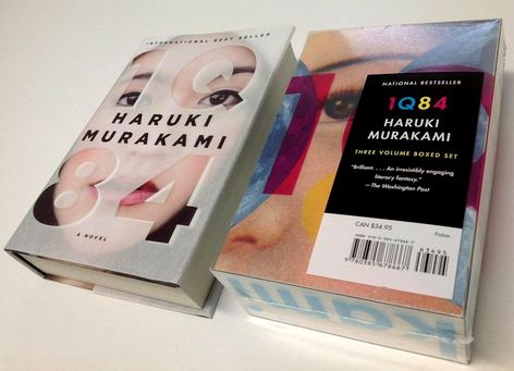
You might think that the regular edition was treated shabbily, no budget left to share. Hardly. The cover of the U.S. edition was designed by veteran Knopf designer Chip Kidd, considered one of the best book designers working today. Fortunately Kidd has talked about his ideas behind the design. You’ll be surprised at how much care was taken to ensure that the visual treatment amplified themes from the text.
idd describes the same process with a different emphasis in a TED talk he gave last year. It’s well worth watching the whole 17-minute video as a love song to cover design. He discusses 1Q84 starting at 14:10.
The effort paid off. Kidd explains: “[1Q84] debuted at number two on the New York Times Best Seller list. This is unheard of, both for us the publisher, and the author. We’re talking a 900-page book that is as weird as it is compelling, and featuring a climactic scene in which a horde of tiny people emerge from the mouth of a sleeping girl and cause a German Shepherd to explode…. Fourteen weeks on the Best Seller list, eight printings, and still going strong.”
According to the New York Times 1Q84 sold 210,000 copies in hardcover in the first six months after publication.
Publishers Weekly picked up on the improbable success of a long, difficult and expensive book. Rachel Deahl explains that the impressive print sales are “thanks, in large part, to an extravagant package that Knopf put together that has made the book the kind of object — beautiful and collectible — that readers want.”
And, as Chip Kidd notes, readers engaged in the text starting with the cover, through the endpapers, the opening page design, right through to the backwards page numbering on right-hand pages.
This to me is the essence of BOOKISHNESS — a design that engages the reader.
A few other design notes:
 As is typical, the U.K. publisher commissioned its own cover for the book. The very capable Suzanne Dean took on the challenge. And failed. I don’t find her treatment particularly compelling even without the comparison to Kidd’s work:
The U.S. paperback of 1Q84 was also a premium effort: “The book [was] published as a three-volume set…. John Gall, the art director for Vintage, designed the paperbacks to be visible through a clear plastic box, fitting together to create one image.”
I’ll end with a thought from Chip Kidd. He explains in his TED talk how he came to understand the task of a book designer: “My job was to ask this question: ‘What do the stories look like?’… A book designer gives form to content…”
PS: I’ll be offering the first presentation of BOOKISHNESS next week at PEPCON: The Print + ePublishing Conference in Austin, Texas.
PSS: The always informative Jane Friedman interviewed the very capable Joel Friedlander about book design print and digital which reminded me that I’m being sloppy in this post by failing to make a clear distinction between cover design and interior page design. They are different beasts, and often demand separate designers. My emphasis here is on cover design. I’d far rather market a book with a mundane page design and a stunning cover than the other way around.