April 22nd, 2013
In our madcap rush to digitize the book we’ve been all too willing to attempt both to replicate the physical book experience in the digital realm and to just as quickly discard any feature of physical books that proved too challenging to emulate online. Part of the problem was inherent in the original E Ink-enabled Kindle. Amazon managed to create a lowest common denominator digital publishing standard. Having done so there’s a real inertia around improved book-like features. Both EPUB 3 and Amazon’s Kindle KF 8 define a robust set of features. And so far the support for these file formats is spotty at best (the BISG [Book Industry Study Group] offers a very useful grid which notes the details of advanced formatting on digital platforms).
Ebooks continue their advance (Bowker pegs ebooks at 28% of the U.S. market in November 2012), taking dollars away from printed books. Bookstores are suffering. The market share of chains, post Borders bankruptcy, dropped from 32% to 19%, while online leapt from 25% to 44%.
Naturally enough my focus shifted backward (or was it sideways?) to printed books. It’s time for a reconsideration. Do we want to hold onto physical? Why? It can’t be for sentimental reasons. Barnes & Noble and 2,000 independents can’t survive on sentiment alone. There has to be a good reason for printed books to persevere.
The physical vs. digital debate makes for a very tired gathering. Each side shrieks its preference, ignoring the other. But by now everyone should realize that it doesn’t have to be either/or. Print books don’t have to disappear for digital to succeed. Digital doesn’t have to drown out physical. On the other hand the decline in print book sales is causing a disruption in the retail channel. While print books don’t have to disappear for ebooks to thrive, Amazon is sucking all of the oxygen out of the room. Barnes & Noble, the last remaining major U.S. book chain, is feeling the heat, closing stores and circling the wagons. Of course it was Barnes & Noble and Borders (R.I.P.) that crippled independent bookselling – now only 3.7% of total book sales. But that’s another story.
Printed books are an essential cog in publishing today because the retail display of books remains an essential part of how people learn about new titles and new authors. Publishers must decide if they’re going to continue to support printed books and the firms that display them. That’s what brought me to BOOKISHNESS.
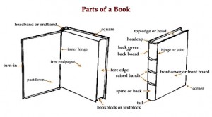
The question I asked myself is what makes a book a book? And more specifically, what makes a print book one kind of book and what makes an ebook another kind of book. Sure, they both contain the same text. But the similarity often ends there. Print books communicate with a richer visual language than ebooks. Ebooks of course can take advantage of the online network in ways that are impossible for print.
Book design is sometimes needlessly florid. But more often the physical design of a book seeks to accentuate and amplify the message of the text. Whether it’s the typeface of the text or the image on the jacket, book designers make the author’s job a little easier by creating context for the content of book. This is how a book becomes bookish.
I want to set out the myriad ways that physical elements of design and manufacture can enhance the bookishness of a book. I eschew the ornamental to focus on adding context or meaning to the message. This is not about books as art. It’s about books as books.
The Bookishness of Printed Books
Dust jacket or Paper cover
- Image (including artwork, colors, inks)
- Substrate, visual aspects of material
- Substrate, tactile aspects of material
- Emboss, die-cut
Binding (and trim)
- Wire-O binding
- Deckled edges
- Endpapers
- Printed Case Binding
- Smyth sewing
- Thumb index
- Inserts
- Irregular trim size
- Lay-flat binding
Paper
- Paper – Interior – Weight
- Paper – Interior – Style, i.e. rag, spotted, etc.
- Paper – Interior – Color
- Paper – Interior – Inks
- Glossy stock for photographs
- Folded sheet for maps, etc.
Interior elements
- Type choices
- Type color
- Charts and maps
- Line art, b&w and/or color
- Halftones, b&w and/or color
- Illustrations, b&w and/or color
- 2-page spread
In the next blog entry I’ll consider some examples of truly bookish books and then reconsider ebooks in the shadow of “real” books – what they uniquely offer and what they leave on the book bindery floor.
I’m looking forward to presenting BOOKISHNESS a week from now at PEPCON: The Print + ePublishing Conference, in Austin, Texas.
May, 2015: I’ve been honing the presentation, expanding the theme. I had great fun presenting at the Bogota Book Fair in April, under the title “Cómo crear libros impresos extraordinarios“. Here is the latest slide deck. My wonderful moderator was María Villegas, author and publisher, whose family firm, Villegas Editores, is a very bookish publisher.

The Great Wave by Guy Laramee:
Beautiful but not bookish.