April 8th, 2010
While researching the preceding blog entry I stumbled on this money-saving tip for the millions of users of desktop printers. Tracking down the source took some detective work.
The news originated on the Printer.com blog. Then Diane Blohowiak, coordinator of information-technology user support at the University of Wisconsin-Green Bay, began testing Printer.com’s claim. Wisconsin Public Radio interviewed Blohowiak, and the Associated Press circulated a short account of the interview on March 25th this year. Associated Press reporter Dinesh Ramde kept after the story and on April 6th this week reported that Blohowiak now expects the university to save 5-10% of it’s $100,000/year budget for ink and toner cartridges. According to a Google search roughly 400 newspapers reprinted Ramde’s thorough reporting since April 6th.
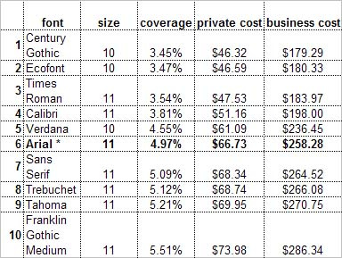
The detail would sound like mumbo jumbo to anyone not involved in desktop printing, but here’s the scoop. For test purposes Printer.com chose Arial. As shown in the chart above, if you switch to Century Gothic, printing costs would drop by 31%. Printer.com calculates that an individual could save a whole $20/year; a small business perhaps $80 a year. Diane Blohowiak has calculated that a major educational institution can save a whole lot more.
On the other hand, if you, your staff or students suddenly fall in love with Franklin Gothic Medium, costs could rise by a full 11% over Arial.
Ah I can hear you thinking: what’s the catch? Alas there are two. As reported in the second AP account, renowned type expert Allan Haley, director of Words & Letters at Monotype Imaging, points out that Century Gothic was designed for titles and headlines, not for full text documents. He still recommends Times New Roman or Arial for their readability.
Problem two is even more perplexing. The design of most letters in Century Gothic, because it’s a headline font, are broader than text fonts, and the same number of letters are going to use more paper when printed with this face. None of the reports state how much more paper.
Instead I’ll point out a third problem expanding Haley’s statement above. Century Gothic is a sans serif font. There are a minority of book designers who would use a sans serif font for long text documents (except for unique design challenges). It’s simply more difficult to read in smaller sizes for extended periods than serif fonts. (No one ever got fired for using Times Roman!)
Here’s an approximation of what the opening paragraph of The Wind in the Willows looks like set in 10 point Century Gothic:

Tiring. But go back to the chart. Times Roman offers a 29% savings over Arial, a mere 2% less than the problematic Century Gothic. Problem solved.
And now the punch line. Printer.com published its original research results on April 13th, 2009! The firm’s headquarters is in The Netherlands and so the data didn’t filter to the U.S. press until it could find a homegrown spin. The direct result: lots of ink and toner unnecessarily wasted in the past year while we avoided the challenge of reading long laser-printed reports set in Century Gothic.
