April 23rd, 2013
I’ve been collecting samples of “bookish” books for a couple of years now. I think these examples can help to clarify the concept of BOOKISHNESS.
There’s a whole category of lovely artist’s books, or books as art, or book arts. As beautiful and creative as they are, they’re a different creature than BOOKISHNESS.
Look at this:
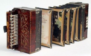
It’s unlikely to bring you to a deeper appreciation of the intricacies of Melville’s work. Or this, The Accordion Book by Peter and Donna Thomas:
Clever, but tough to read on a plane. Those are both examples of “books as art”. They do not represent BOOKISHNESS.
Now take a look at Brian Selznick’s The Invention of Hugo Cabret?

A stunning book, 533 pages, not yet in digital form, made into an equally remarkable Scorsese film. As Selznick writes: “Unlike most novels, the images in my new book don’t just illustrate the story; they help tell it.”
Consider Jonathan Safran Foer’s Extremely Loud and Incredibly Close, a bestselling book that became a movie, generating a paperback design that merged the best of the first book design with the best of the film poster imagery.

Foer has gone on to work with the U.K.’s very imaginative Visual Editions to produce one of the most stunning examples of bookishness that I’ve ever seen: the Tree of Codes. Based on The Street of Crocodiles by Bruno Schulz, Foer cut into and out of the book. In an interview Foer says: “This book is mine. His book is a masterpiece, this was my experiment. My story has nothing to do with his story… I’m not interested in experimentation for its own sake. But I’m interested in works of art that transport a reader. That send you to a different place—pure magic.”

Coming back down to earth I’ve been marveling also at how designers are approaching the challenge of creating book covers that attract a public hopelessly distracted by imagery, and as likely to shop online as in person.
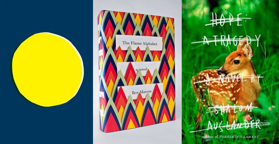
The first cover, designed by Jon Gray for Albert Espinosa’s The Yellow World, is particular audacious, a crudely drawn yellow circle, placed imperfectly on a blue background. That’s all. Says Gray: “I also thought it would stand out against other books and without type would make you want to pick it up and find out more.” Gray also designed the cover for Extremely Loud and Incredibly Close. The second, The Flame Alphabet, was designed by Peter Mendelsund. Gray says of this book, “A simple idea beautifully executed in rich, warm colors… You want to hold it, own it and buy it for your friends.” The third, designed by John Gall, I selected mostly for its near-fluorescent green, even more powerful than the image of the vulnerable young deer.
A book I bought used a few weeks ago is a reminder that there are lots that can be done with trim, not all of it quite so obvious as this:
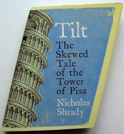
These then portray aspects of BOOKISHNESS. By carefully adding value to the design or manufacture of a physical book the author’s message can be more readily absorbed. By appealing not just to the reading mind but also to the eye and to the touch the book seduces its readers, pulls them in, welcomes them home. The last thing we want from print books is monotonous pages of cramped type: ebooks are preferable if that’s the best a publisher has to offer.
Soon I’ll look at ebooks through my BOOKISHNESS goggles. I don’t see ebooks as the less important invention. What they lack in design delights they can more than make up for with unique digital features. The BOOKISHNESS challenge for publishers producing both print and digital is making each edition uniquely valuable to the reader.
But before I get there I consider The Case of Murakami’s 1Q84.
I’ll be making my first public presentation of BOOKISHNESS next week at PEPCON: The Print + ePublishing Conference in Austin, Texas.
