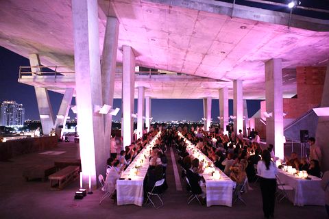
January 24th, 2011
1. Read the article in today’s New York Times. It’s about a remarkable new structure in Miami’s South Beach.
2. Go to the new building’s web site, and click on this graphic:

3. After the well-designed flash images flash by, take time to interact with every graphic you can click on. Unlike so many sites that feature strong design elements, each click returns a useful image, a useful piece of information, or takes you to your next destination on the site.
4. Now pause to ponder.
What have you just encountered?
What does this mean to you?
5. Now answer yeah or nay:
(i) Does this look like a great building?
By great I mean audacious and original, fun yet functional.
Does it reveal to you something about the character of Miami Beach, whether you feel positive or negative.
(I’m guessing that you don’t develop strong feelings about most new building in the city where you live.)
(ii) Is this a great web site?
By great I mean audacious and original, fun yet functional.
(iii) Can you imagine accomplishing what this site accomplishes in any other medium?
Direct mail would just cheapen the image, unless a lot of money was spent on developing the piece.
A magazine could capture some of the bright images, but would be challenged to convey the motion.
Would you sit still through “the movie”?
(iv) Finally: Do you feel like you want to celebrate your next big birthday/anniversary/rebirth at 1111 Lincoln Road in Miami Beach, FL?
