November 10th, 2010
In Vancouver the public transit is operated by Translink. There are lots of good things to say about Translink. The buses are clean and fairly punctual and the drivers are generally friendly and helpful, sometimes exceptionally so. The routes are well-planned and the service frequent. The SkyTrains are a marvel of efficiency and comfort. The train service to the airport, launched during this year’s Vancouver Winter Olympics works brilliantly. It takes you to the airport in record time and the price is a bargain.
Translink’s website sucks.
Of course “sucks” is relative. It doesn’t suck as bad as many other public transportation websites. And it does some things well. But it sucks in two important categories:
1. Passwords.
Unlike nearly every other website in the universe, your password for Translink must include not just letters, not just letters and numbers, but “must contain a minimum of 8 characters, at least 1 non alpha numeric character, and at least 1 numeric character.”
Then you must enter a Google reCAPTCHA. I’ve written about these sometimes-nifty check-if-you’re-human utilities before. More recently I’ve been collecting some crazy samples of inscrutable reCAPTCHAs. Here are a few from my collection, blended into a single image:
An outcome of Translink’s registration process is that it took me about 20 minutes last week to register, and so I was 20 minutes late for the launch of Daniel Francis’s new book. Yes, if I’d just read the fine print I’d have registered more quickly. But, like you, I’ve now registered for hundreds of sites, I no longer read the fine print, and by default register with an alpha-numeric password, which nearly always works. I was left wondering why a bus schedule website would insist on such draconian security, and posed that question in a comment form on site.
2. Typing your address to find the next bus.
A little knowledge is a dangerous thing. Many of the streets in Vancouver are numbered: the major east-west thoroughfares number from First Ave. to 73rd Ave. But don’t try typing those numbers as words, and don’t forget whether the address is east or west. The form on the site tries to make an informed guess. In my experience it usually just gets baffled, or guesses wrong.
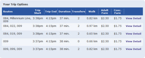
Then when you finally do enter the right address the system looks for every possible combination of bus routes that can bring you near your destination, with the default sort being total travel time in a moving vehicle.
So, nobody’s perfect, and few websites are. But can’t these problems be fixed?
To Translink’s credit, a genuine human telephoned me yesterday to respond to my criticism about the password. I was told that the reason for the complex password is that two years from now the site will link to payment information, at which point the extra security will prove valuable. I did not ask why Translink does not follow S.O.P. and ask customers to change their passwords if and when it becomes necessary to do so.
I did take advantage of the human to ask about the buggy address recognition system. I was told that the original programming for the site was very expensive, and would now be prohibitively expensive to fix. Many aspects of the site work well, so why throw the baby out with the bathwater?
Hmm. Interesting rhetoric. It’s possibly a plausible argument to make to folks who complain about how tough life can be living in Western countries. “Well, try living in Africa,” some respond.
I don’t think the rhetoric applies to websites. If a core function doesn’t function the programmer should be asked to fix it. Someone at Translink signed off on this project perhaps without fully testing it first.
And if all else fails, there’s always tactic #2 for those who complain about the usability of your site. “Well, it works fine for me,” I was told yesterday. “I don’t know why you’re having a problem.”


