October 16th, 2011
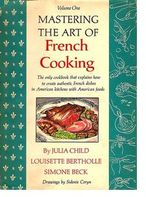 Reading the New York Times article about the e-book version of Julia Child’s classic Mastering the Art of French Cooking you’d think that a milestone had been reached in the struggle for high-quality e-books. This 1961 book is one of the classics, and the publisher had a tradition to uphold.
Cookbooks have not been a big hit as e-books and part of the problem is assumed to be their complex formatting. Knopf in fact abandoned its first attempt to create an e-book from Mastering because the “technology was not available” to recreate the book’s “distinctive two-column format.”
The story of the Mastering the Art of French Cooking e-book affords an opportunity to look at the current state of e-book creation and the strengths and limitations of the e-book formats in use today. I call this tale Mastering the Art of e-Book Formatting.Although Knopf did not share its recipe with me, I was able to obtain a sample of the dish, to reverse engineer it, and figure out how it was made. I’d like to share that with you.
While there have been many bestselling books about cooking and even a few bestsellers about cookbooks, Julie & Julia is the only hit movie about a cookbook. Mastering the Art of French Cooking was already a huge success before the 2009 hit film, Julie & Julia, featuring Meryl Streep’s extraordinary personification of Julia Child (along with a thoroughly forgettable protagonist). With 2.5 million copies sold in over 50 printings, it’s considered an American classic, a book that brought sophisticated continental cooking techniques to 1960s American housewives.
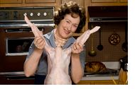 Jennifer Olsen, the manager of digital production for the Knopf Doubleday Publishing Group, is quoted in the Times noting that “cookbooks often have incredibly complex layouts,” and are therefore “very tricky to produce as e-books.”
Judith Jones, the noted Knopf editor who originally acquired “Mastering” in 1961 (after the manuscript was rejected by Houghton-Mifflin) argued that Knopf “should abandon the effort until an e-book could faithfully reproduce the original.”
When Knopf tried again this summer, the production staff had the entire book retyped by hand, “since no electronic file of the book existed.”
The illustrations throughout the cookbook — tiny sketches of sauté pans and freshly julienned carrots — were scanned at a high resolution so they could be transferred to the e-book.
Finally, “when Ms. Jones saw the new e-book edition, she was persuaded that it should be released. “I suddenly saw the difference,” she said. “You really could almost improve on how you read the book.”
Wow, that’s dramatic. Now let’s parse the article.
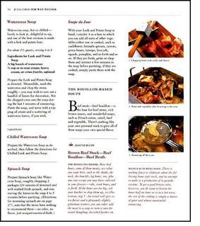
A More Complex Layout in Vol 2 of Julia’s Cookbook
+ “Cookbooks often have incredibly complex layouts.”
True, some do. But Mastering the Art of French Cooking is not among them. It has a straightforward two-column layout (in a few sections, three-column).
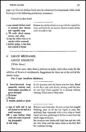
Not a Complex Layout, Except for an e-Book
The layout was original in its time. As Sara Dickerman points out, “Ingredients are not sequestered at the top of each recipe, but rather printed in the left column at the point in the procedure when they are introduced” allowing recipes to “flow into one another as a master recipe is elaborated into multiple variations.” This was original in a 1960s cookbook, but not a typographic page layout challenge.
It is, however, a layout challenge for e-book formatting.
E-books are formatted into two main file formats: EPUB and Mobi. Amazon uses Mobi; everyone else mostly uses EPUB, the industry standard. EPUB is, broadly speaking, more versatile than Mobi, although each has its idiosyncrasies.
These two formats were designed in early e-book days and primarily with the view to affording simple books of text.
Table support (i.e. multiple columns) wasn’t added to the Kindle platform until the Kindle 2 (February, 2009), although the fall 2010 Kindle Publishing Guidelines still cautioned: “For more complex tables that have nested rows/columns or use very specific formatting, we recommend converting to an image.”
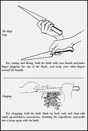
High-Resolution Images of Knives and Hands
+ The illustrations were scanned at a high resolution…
One of the apparent contradictions of image scanning is that simple line drawings need to be scanned at much higher resolution than photographs. This is because there’s more visible detail in a thin line than in a continuous tone picture. So high resolution scanning is required for line art. But it’s no big deal. An HP scanner with 4800 x 9600-dpi resolution costs under $100 these days.
+ The entire book had to be retyped by hand, “since no electronic file of the book existed.”
Well, that’s not actually accurate. Arguably it would have been easier to use OCR — Optical Character Recognition — on a print-out of the existing text. OCR has no difficulty detecting 2-column layouts. And the book was re-typeset earlier this year by Penguin Australia for the 50th anniversary edition.
Well, regardless. The works been done and here are the results:
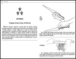
The Layout Looks Good Here
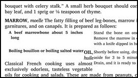
Sometimes Those Pesky Columns Won’t Line up
The best solution to the Julia Child Challenge may well have been to accept that online books are a new medium that call out for new solutions. I think I’ll wait for the app. After all, the book really isn’t sacrosanct. Back in 2009 Anne Bourget painstakingly compared the 40th anniversary edition with the first 1961 volume to track what had changed. There wasn’t a whole lot, but, for example, Tournedos Rossini was rewritten with artichoke bottoms substituted for artichoke hearts. I think I can taste the difference.
December 7, 2011: The “QED” seal is awarded to ebooks that satisfy a baker’s dozen checklist for ebook production quality. bit.ly/tmOWFx