September 17th, 2009
A subject which receives far too little coverage in the great eBook orgy is just how much is lost in the conversersion from books-on-paper to eBooks in one of the many eBook formats. What is lost: nearly every visual element, from typeface choices to page design.
As this May 2009 article on Wired.com states:
“Ultimately the sticking point for e-books is accessibility,” says (Pablo) Defendini. “A large component of this is making sure the text flows right and the fonts are appropriate, even while giving the reader choice to change that. That flies in the face of the traditional role of a typographer, who is in minute control of everything.”
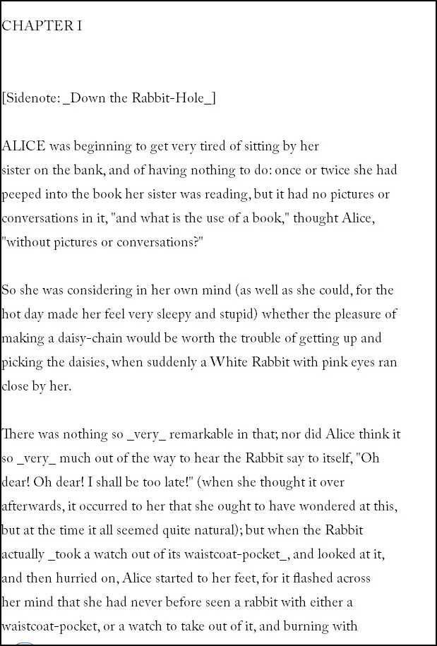
Project Gutenberg is justifiably famous and lauded for its pioneering efforts to place many books from the public domain into a free database. It has traditionally placed those books into its database in ASCII text only, of course thereby losing all of the typographic niceties, as well as the illustrations. The #1 download from this site is Alice in Wonderland. Here is what the text format appears like on your screen:

To Project Gutenberg’s credit, it is now expeimenting with several eBook formats.
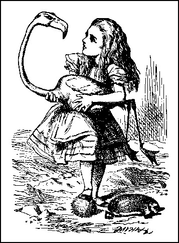
Here is one the the very famous Tenniel illustrations that appears in the most revered version of the book:

The subject of course begs the old question: how important is book design (and illustration) to the comprehension and appreciation of a book.
This is a complex topic I’ll shortly be offering a briefing on. Stay tuned.